Many of you probably use one of the classic Power BI patterns – a dynamic selection of the measure displayed in the report. Agree, a very convenient thing – the user himself can choose what he wants to see: sales, conversion, the number of orders, or some terrible and infinitely important KPI that only 3.5 people understand in the whole company.
However, this method has at least one drawback: the formula changes dynamically, but its formatting does not. As a person whose main skill is data visualization, it drives me crazy. Actually, it drove me crazy. Because now I’m going to show you how we can get our measures to format correctly. Step by step, and with a description of possible pitfalls in unexpected places.
As usual, the report is available for viewing here, and for downloading from here.
Note: I do not pretend to be a specialist in calculation groups. This article is just a try of a belated answer to numerous questions from colleagues and former students of my learning courses about the dynamic measure selection pattern. Fortunately, the latest Power BI updates give me the ability to finally answer them clearly and intelligibly. If you want to see over-optimized code and elegant solutions using calculation groups – you have a direct road to Italians 🙂
Before we start
You need at least the August 2020 version of Power BI. You can use the July version, but no older than 2.83.5894.961 – there was one critical bug fixed related to our topic.
In the preview features, the enhanced metadata format must be turned on, otherwise, our next actions can have a wide variety of consequences.
And finally, we need the latest version of Tabular Editor, which can be opened directly from External Tools pane of the Power BI app. You can use not the latest, but then figure out by yourself how to connect it to your model. I’m too lazy to google that.
One more thing – since we are working with third-party applications, please back up your pbix file.
So let’s go
First, I’ll show you what the final report looks like. Motivation, all the stuff…

Suppose you already have a report with some measures between which you want to switch (if not, download the ready-made solution at the beginning of the article and start from scratch).
In my case, these are Sales, Quantity, and Margin%. Of course, I want to show sales in currency format, quantity as the whole number, and margin as a percentage. Nothing incredible.
Open Tabular Editor using External Tools. Right-click on Tables – Create New – Calculation group:

The group has been created. Rename it to “KPI” – only for this article, then you can name it whatever you like, its name is not displayed on the front-end. Also, it has a Name element inside – we also leave it as it is for now, but keep in mind that in the future this will be the title of the measure selection slicer (if, of course, you will display it). But most of all we are now worried about the Calculation Items object – here we will add all our measures.
Right Mouse Button on it – New Calculation Item:

Right there we rename it (in my case, to “Sales”). In the large field on the right we enter the expression SELECTEDMEASURE () – just do it, I’ll explain everything later. You should enter carefully – there is no IntelliSense in the tool! You can use the DAX Formatter button for safety – it will give you an error in the status bar if something went wrong.
Now we will do what we made all this stuff for. On the right below we see the Format String Expression item – in it, we enter something like “$ #, 0.00; – $ #, 0.00”, or any other format in which, in your opinion, sales should be displayed. Do not forget about quotes!
BTW, if you forgot to rename your Calculation Item, you can also do this by editing the Name item in the list of properties at the bottom right.
The first element of our group has been created. Then create two more items: Quantity and Margin, write SELECTEDMEASURE () and enter “#, 0” and “#, 0.0%” respectively as format strings. Everything should look something like this:

Now we save all this beauty in Tabular Editor: File – Save.
After that, some motion will begin inside the Power BI, and as a result, it will show a yellow pane on the top with the only Refresh now option. Just press it.

As a result, we have a new table in the data model, with the name of our created group, and the only (so far) column that contains the names of our Calculation Items. You will not see the formulas themselves in the program interface. At least at the time of this writing.
The next step should be familiar to you. This is a switch measure creating. It should look like this:
_KPIValue =
    SWITCH (
        SELECTEDVALUE ( 'KPI'[Name] ),
        "Sales", [_Sales],
        "Quantity", [_Quantity],
        "Margin%", [_Profit%]
    )
Note that now we are not creating a special disconnected table – we already have it in the form of a calculation group.
All we have to do is create a visual, add [_KPIValue] to it, and add a slicer to the page containing the Name field from our calculation group. And, of course, make it a single select.
As a result of these simple actions, you get exactly the same result that I showed at the beginning of this section – a wonderful graph with dynamically changing formatting.
What happens is SELECTEDMEASURE () returns us the result of the [_KPIValue] measure, but, depending on the selected Calculation Item, it formats the result differently, based on the formatting string we have written for each slicer selection. Exactly what is needed!
At first glance – here it is, success! But wait. Not so fast…
Problem #1. If there are other measures on the page that you don’t need to format, Power BI will spoil them anyway
Our slicer now absolutely doesn’t care which measure to format. If only one metric is analyzed on your page, then no problem. But in most cases, we have much more than one.
Let’s say we want to see a card with the absolute amount of profit next to our chart. Profit by itself is not included in our calculation group, and we would not want its format to differ from the one we manually set (I deliberately made it different from Sales). However, Power BI has its own opinion on this matter:

The simplest and most logical thing that comes to mind is to turn off the influence of the slicer on the profit card using the Edit Interactions menu. And it works. You can check it by yourself.
But let’s consider another option. Let’s say I want to see both the profit and the measure selected in the slicer on the same chart (or table, it doesn’t matter). The influence of the slicer cannot be turned off, since our switch-measure will break. And we get this… something:

Since such visualization is quite possible and even makes some sense, we need a way to trick Power BI and force it to apply formatting only to the [_KPIValue] switch measure. And there is such a way.
Go to Tabular Editor again, select the Sales item, and edit the Formatting String this way:
IF (
    ISSELECTEDMEASURE ([_ KPIValue]),
    "$ #, 0.00; - $ #, 0.00",
    SELECTEDMEASUREFORMATSTRING ()
)
I think this is the rare case when the names of the formulas speak for themselves. If the calculation group sees the measure [_KPIValue], it is formatted based on our logic. If any other measure is in scope, its formatting remains the default.
Copy the logic to the rest of the items:

As a result, our Profit retains its original formatting – currency without decimal places. The chart, of course, should be turned over and a secondary axis added to it, but you get the point – the profit format is now independent of the slicer value.

Note: After these steps, I noticed that now the formatting of measures is a little strange. You should better do it in the Modeling tab. Moreover, for the format changes to take effect, you need to interact with the report. Better yet, update all visualizations with the Performance Analyzer to clear out the unnecessary cache. A very funny bug, although not critical at all.
Problem #2. Power BI now formats only the hardcoded measure. But we need to format another measure on the same sheet in the same way.
Let’s say I want to add another card and put the following measure in it:
_Unfiltered =
    CALCULATE ([ KPIValue], REMOVEFILTERS ('Table'))
So, I want to always see the overall metric even when the report is filtered by category or whatever. The problem is that now our slicer does not affect it – instead of 33.7% we see the default decimal format:

Fortunately, the solution is very simple. ISSELECTEDMEASURE () can take more than one parameter, so we just add one more measure to our three formatting lines. Something like this:

Well, in dynamics everything now looks great for us:

Problem #3. Code maintenance and scaling
Surely some of you, after the changes made in the previous paragraph, have asked a reasonable question: “What if there are many such measures? What if there are, say, 20 items in my group? Should I change the formatting strings manually each time?”
Yes, I completely agree with you. More code means more errors. More duplicate code means more headaches for you in a few months.
However, there is a solution here as well.
In the package of Power BI functions, related to calculation groups, there is another interesting function – SELECTEDMEASURENAME (), which returns the name of the current measure. Therefore, we can compare this name with anything else…
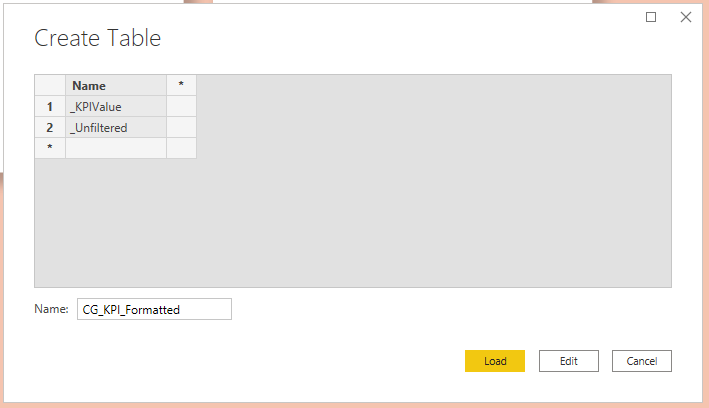
In Power BI, let’s create a new table through the Home – Enter Data. Let’s call it, for example, CG_KPI_Formatted, and add the names of the measures which we want to apply our dynamic formatting to:
Now go back to Tabular Editor and edit the formatting lines for each item (for the last time, I promise!) using the SELECTEDMEASURENAME () in VALUES (‘CG_KPI_Formatted’ [name]) construction:

Click Save.
You won’t see any changes on the Power BI front-end. We did all of this for “the-future-you” when you will need to add another measure that needs to be dynamically formatted in a similar way. To do this, you will simply add its name to the CG_KPI_Formatted table, and that’s it.
Of course, you can create several such tables for different groups, or one, but with an attribute for filtering. And in general, using all the functions that we have considered in this article, and using some imagination, you can quite flexibly format any measure. Just don’t overdo it 🙂
Problem #4. Order of measure names in the slicer
The little problem for dessert. I want to arrange the Names in the slicer not in alphabetical order, as now, but somehow differently.
It’s simple – in Tabular Editor, just use drag-and-drop within one group, or edit the Ordinal property for each item, starting from 0:


After that, click Save, and click Refresh in the yellow pop-up panel in Power BI. Done!
Summing all up
Let’s take another look at the final picture:

To be honest, I have not used all of this on my main projects, so, quite possibly, there are still some pitfalls that I have not encountered. Please write in the comments – let’s solve all possible problems together 🙂
In general, the solution is somewhat more complicated than the canonical pattern. You also need to work with Tabular Editor, which interface does not resemble Power BI in any way (and it shouldn’t, in fact). However, in my opinion, the ability to dynamically format absolutely any measure negates any complications and disadvantages of this solution.
What do you think?
Hi, i noticed that as soon as i hit save with the calculation group added to the model, all my numeric fields get transformed into text fields in the datasource (they don’t have that sum symbol next to numeric fields anymore), and this prevents me from using the numeric fields in a visual
I can create a measure = SUM(numeric_field) and use the measure for the visuals, but i can no longer use numeric_field by itself in other visuals, have you got any idea how to fix this?
In your .pbix that i downloaded, you have the same issue
hmm…
I cannot reproduce this issue. Everything looks fine in my case.
Do you use the latest version of Power BI Desktop? Did you checked the new metadata format preview option?
We noticed the same thing. This seems a limitation, as soon as you use calculation group vai tabular editor, all sum, count, etc. cannot be used anymore directly on visuals. You have to create them as true measures, which gives the same thing and I beleive is also a good practice, since it centralizes all measures. This small thing to me is nothing compare to the benefits of using calculation groups!
Hello, I am also having the same issue. Additionally I have noticed that the formatting in certain visuals have become unstable, my theme colour are not longer being applied correctly, and some visuals like Stacked bar charts on other pages, no longer display ANY formating in the datalabels.
Have you come across a solution?
I tried this approach but the formatting is still not showing up correctly, I have 2 currency values and one is Whole number that I need to switch. I checked everything but somehow couldnt figureout why its not showing correctly. Version I am using is “Version: 2.84.981.0 64-bit (August 2020)”
Great post, I really like it! I enjoy the benefits of calculations groups in PowerBI since it’s out, but didn’t realize we could act on formatting as well. I have some similar case so I will definitely use your tricks 🙂
To iamshaz, yes we noticed the same thing. This seems a limitation, as soon as you use calculation group vai tabular editor, all sum, count, etc. cannot be used anymore directly on visuals. You have to create them as true measures, which gives the same thing and I beleive is also a good practice, since it centralizes all measures. This small thing to me is nothing compare to the benefits of using calculation groups!
Thanks again!
This was super helpful. Thank you!